My Lady
Sanitary Pads
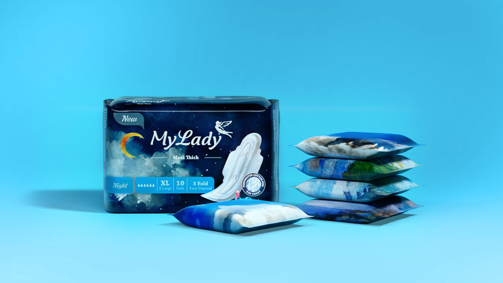
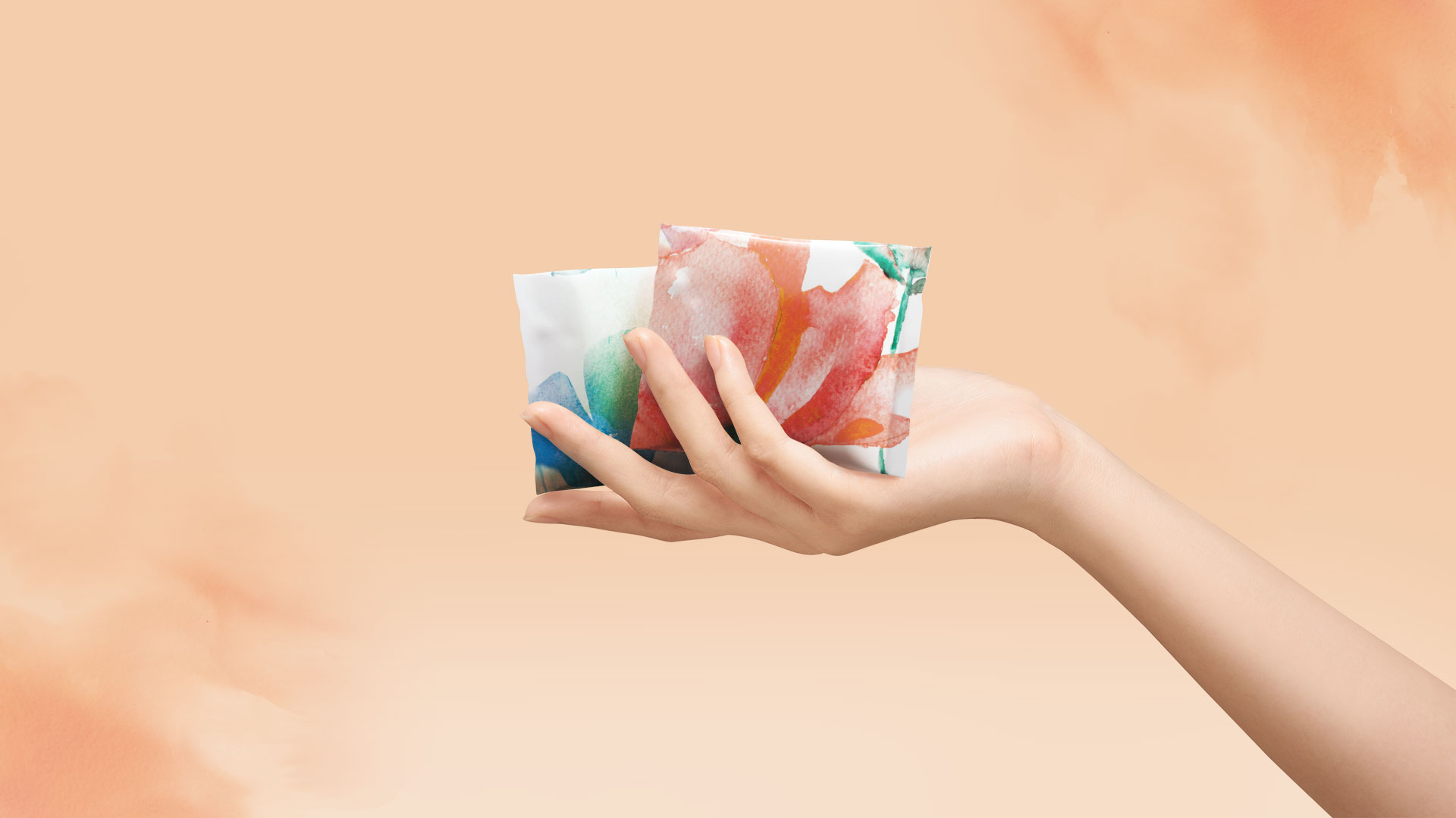
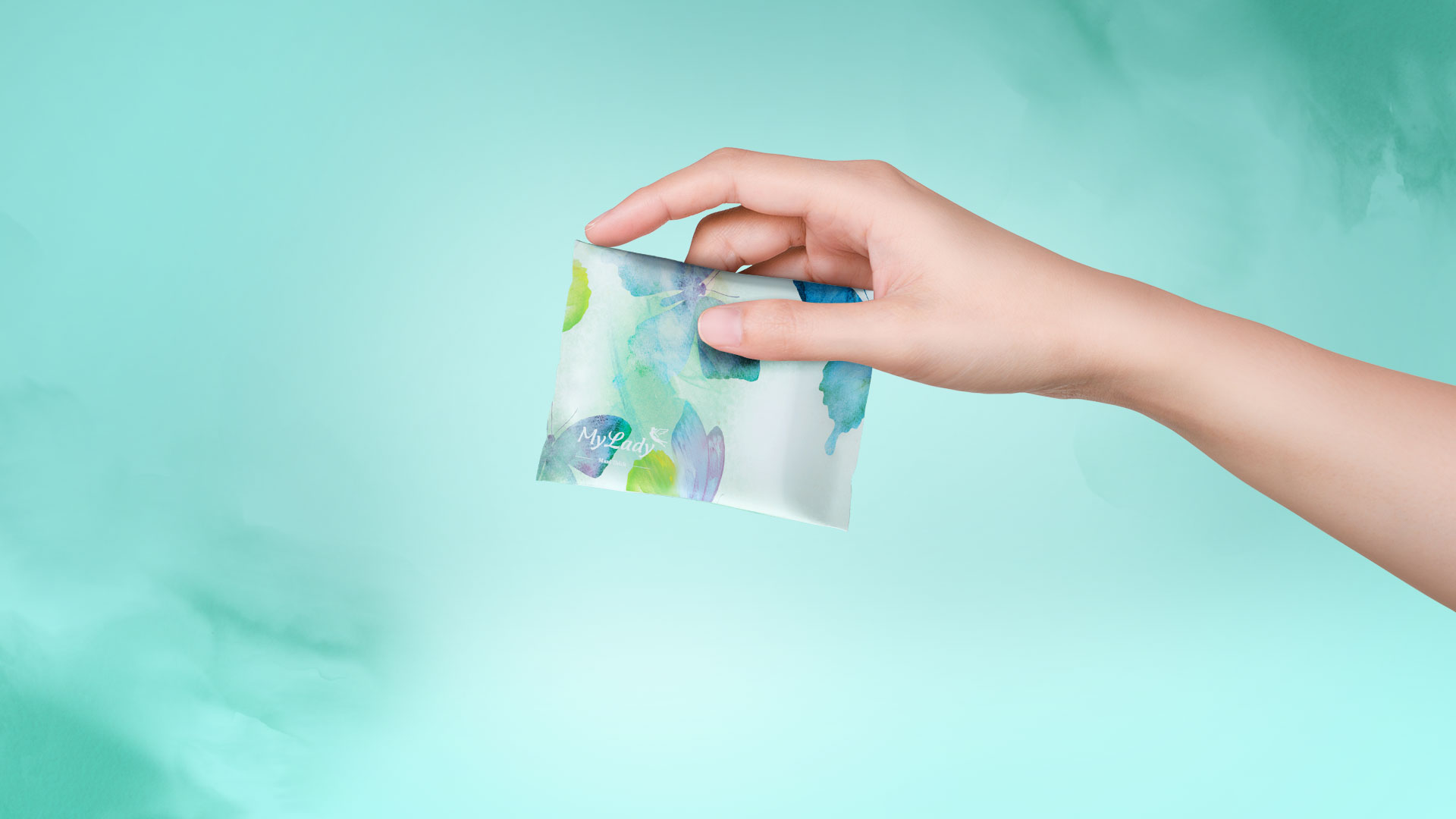
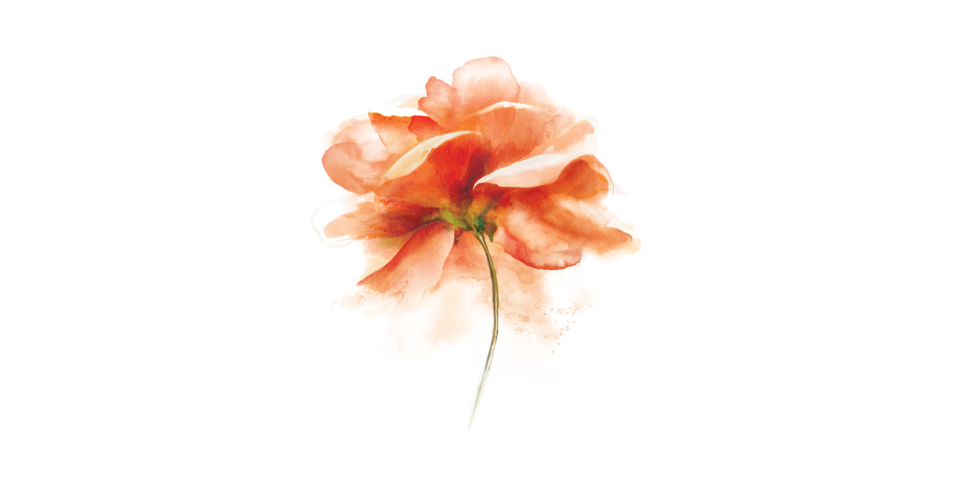
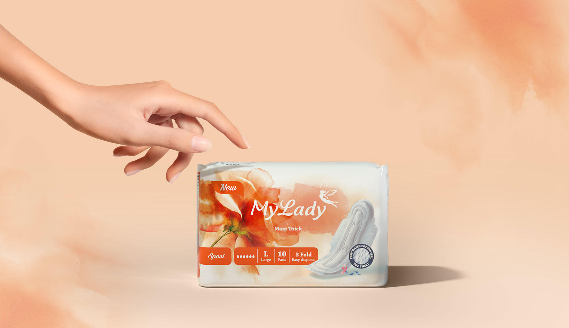
My Lady is a well-known sanitary pads manufacturer in Iran. For their rebranding project, we used watercolor textures and patterns to reveal the nature of product. Since the audience were well-acquainted with the brand’s former identity, we didn’t make major changes nor in the colors neither in the logotype. But the fairy flying above the logotype was completely reshaped to become livelier, more spirited and more fashionable.
My Lady’s new packaging and single wraps was shortlisted in New York Festivals in 2021.

